Haaner Felsenquelle / Bergische Waldquelle
The family-owned company “Haaner Felsenquelle GmbH,” an officially recognized medicinal spring, has been in existence for over 111 years. As the only mineral spring in the Bergisches Land region, it successfully operates two regional brands: “Haaner Felsenquelle” and “Bergische Waldquelle.”
Both water brands primarily define themselves through their origin, making them pioneers among sustainable mineral springs: through regional marketing, careful use of resources, environmentally friendly and energy-efficient production, as well as support for local initiatives.

Positioning of corporate and product brands.
Despite the differences between both mineral water brands, they share a commonality: their origin in the Bergisches Land. This uniqueness imparts all the positive characteristics of the region to them, such as freshness, tranquility, purity, and the power of nature. They share their homeland with the people who choose to live there – healthy and sustainable.
The claim developed by B+D, “BEWUSST BERGISCH,” encapsulates this sense of life and describes the factual as well as emotional added value of the brands.
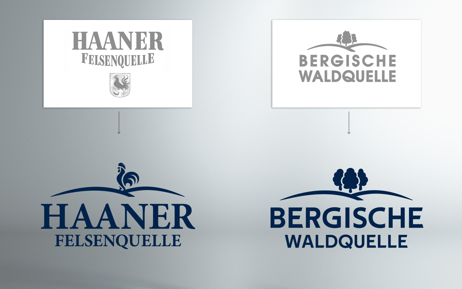
Logo Redesign
To not only thematically unite both anchor brands of the company through a common claim but also visually synchronize the previously distinct logos without jeopardizing their distinctiveness. This ensures that at first glance, it is clear that both brands come from the same house. Design-wise, typography and design elements have been updated and aligned with modern visual preferences.

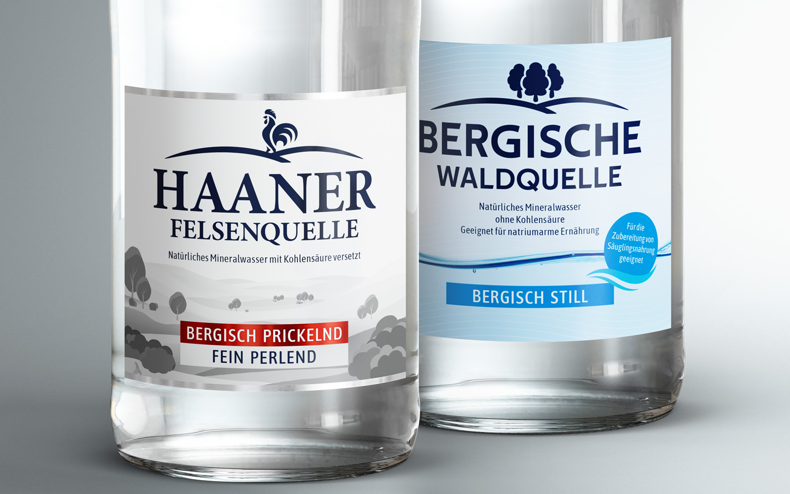
Re-design for both water brands and refreshment beverages.
As part of the brand repositioning, a design uplift for the entire product range was consistently developed to achieve a comprehensive update of brand perception. Through a comprehensible systematization of the assortment, this aims to provide consumers with improved orientation, across all glass and PET containers.

X / X
Packshot campaign, pretty Bergisch.
Like everywhere, the Bergisches Land has its peculiarities, special features, and charming quirks that form a blend of benevolent prejudice and proud inner attitude. All those endearing characteristics that characterize a region and make it lovable.
The campaign consciously leverages this charming form of local context, allowing the products to be portrayed as local heroes, with a clear focus on love for the homeland and sustainable responsibility.
X / X